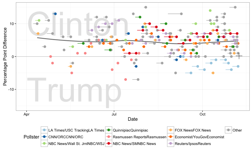
The website RealClearPolitics tracks poll results for this presidential election
Polls of Clinton versus Trump at the national level available at http://www.realclearpolitics.com/epolls/2016/president/us/general_election_trump_vs_clinton-5491.html

The difference between Clinton and Trump is shown for each poll over the 6 months leading into the election. The horizontal lines indicate time frame that survey is conducted and poll result is the point at the end of each line. Colour indicates pollster, only major ones shown, and others are grouped into the Other category. The polls are averaging above zero difference between candidates. The “+” indicates the actual popular vote result. (Thanks to Heike Hofmann for putting the code together.)
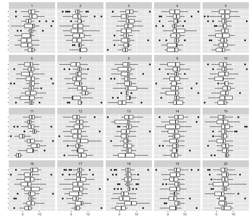
Are the pollsters measuring the same election? Side-by-side boxplots show the difference between candidates by pollster. One of the 20 plots is the actual data, and the remainder show data where pollsters are permuted over the polls. If there is no difference between pollsters results then the data plot should not be visible from the others. I think that you can see that one plot is different from the others. The pollsters tend to have consistent bias in their results which is why aggregators like http://fivethirtyeight.com weight and skew the pollsters results in their models.

Results by county, in relation to 2012
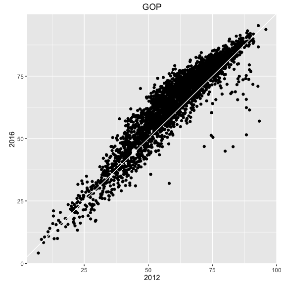
The percentage for the GOP candidate for each county (FIPS) 2016 is shown against its percentage in 2012. What we see is mostly a consistent shift in favour of the Republican candidate, Trump in 2016, except for a handful of counties (primarily in Utah). Personally I find this disturbing because it indicates a large number of people embracing hate speech against women and non-whites and disabled members of society.
